
Saturday, December 31, 2011
A Simpler, Freer Life | Adbusters Culturejammer Headquarters

A Simpler, Freer Life | Adbusters Culturejammer Headquarters
“Let us consider the way in which we spend our lives,” Thoreau began one of his essays, noting that since time was short he would “leave out all the flattery, and retain all the criticism,” as was his way. “What is it to be born free and not to live free?” he asked his fellow citizens. “Is it a freedom to be slaves, or a freedom to be free, of which we boast?” America may have been free from political tyrants, but it was painfully clear to Thoreau that it was “still the slave of an economical and moral tyrant.”
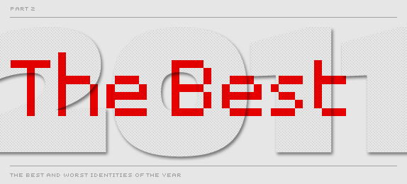
To end the year on a positive note here are The Best Identities of 2011. As much as I enjoy posting the train wrecks, the Bests are more fun, mostly because my selections tend to generate plenty of disagreement. You can catch the worst here. Enjoy and see you in 2012.
The Best and Worst Identities of 2011, Part I: The Worst
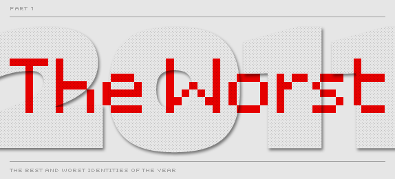
Without much further introduction — since now you know what to expect from our end of year round-ups — here are The Worst Identities of 2011. Enjoy! Part II: The Best will come next Monday.
For clarification: The choices are solely at my discretion. Original comments and voting results do not really influence my selections.
Friday, December 30, 2011
There’s an App for That: World War II Posters

From the classic 'Make Do and Mend' and 'Dig for Victory' to lesser-known gems, the posters featured in Great British Posters from the Second World War showcase the striking design, humour, memorable slogans and defiant spirit that helped to carry Britain through some of its darkest hours.
With this app you can:
- Discover the stories behind the posters with supporting information from IWM's experts
- Explore over 30 posters on your iPhone or iPad
- Get up-close to the posters by scrolling, pinching and zooming
- Share your favourite posters with friends via Facebook, Twitter and email

There’s an App for That: World War II Posters - UnBeige
Saturday, December 24, 2011
On Jet Exteriors, a Parade of Vanilla
 |
| As domestic airlines have taken a more sober approach to the business of flying, fancy fuselages and lively paint jobs have faded away. The color of choice these days is white. |
The colorful paint jobs on airplanes have gone the way of free meals and pillows.
After decades of frenzied competition and staggering losses, domestic airlines have taken a more sober approach to the business of flying, with their first priority making money. And so the fancy fuselages and lively paint jobs — remember TWA’s bold red lines? — have gone the way of free meals, pillows and checked bags.
read the article
Wednesday, December 14, 2011
Graphic Content | Good Chemistry

December 06, 2011
By STEVEN HELLER
Graphic designers such as Simon C. Page are working with the scientific community as it reaches out to be better understood by people both outside and within its ranks.
In something of a trend, graphic designers are working more closely with the scientific community as it reaches out to be better understood by people both outside and within its ranks. Simon C. Page, a London-based graphic designer, is the latest example of what I like to call a sci-graphiste. Page, who has a degree in applied mathematics, has designed a series of 10 posters for the International Year of Chemistry. Not only does the subject resonate with him, Page says, but it’s also “a bonus” that his work is “helping an industry which is struggling to be heard.”
Read the rest and see the images at T Magazine: Graphic Content | Good Chemistry
Tuesday, December 13, 2011
'Comic Sans Project' Seeks to Save the Web's Most Hated Font

The font’s childish, unsophisticated scrawl and overuse by armchair designers has rendered it taboo in most artistic circles, and the sophisticated web at large enforces a moratorium on its use. Some have even campaigned to rid the web of it forever.
But despite the haters, French designers Thomas Blanc and Florian Amoneau have sought to spark a movement. Their new Tumblr, entitled the Comic Sans Project, tries to re-imagine the much-maligned font by posing a simple aesthetic question: What if the world’s most recognizable logos used Comic Sans?
'Comic Sans Project' Seeks to Save the Web's Most Hated Font
Sunday, December 11, 2011
Sunday, December 4, 2011
Selling Books by Their Gilded Covers
 |
Jay-Z signing a copy of “Decoded,” his intricately jacketed memoir. |
[NYT December 3, 2011]
By JULIE BOSMAN
Even as more readers switch to the convenience of e-books, publishers are giving old-fashioned print books a makeover.
Many new releases have design elements usually reserved for special occasions — deckle edges, colored endpapers, high-quality paper and exquisite jackets that push the creative boundaries of bookmaking. If e-books are about ease and expedience, the publishers reason, then print books need to be about physical beauty and the pleasures of owning, not just reading.
The Fashion Network Association (SFSU) Presents IMPRESSIONS
Winter Runway Show
December 9th, 2011
Jack Adams Hall
Cesar Chavez Student Center
San Francisco State University
$10 General Admission
$5 with student ID
Doors Open at 6:30pm
Show Begins at 7:00pm
Donate 1 Article of Clothing & Receive 1 Raffle Ticket
Donations to Goodwill
www.fnasf.com
December 9th, 2011
Jack Adams Hall
Cesar Chavez Student Center
San Francisco State University
$10 General Admission
$5 with student ID
Doors Open at 6:30pm
Show Begins at 7:00pm
Donate 1 Article of Clothing & Receive 1 Raffle Ticket
Donations to Goodwill
www.fnasf.com
Subscribe to:
Posts (Atom)