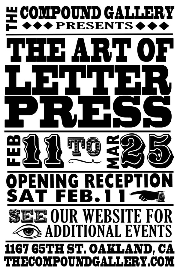
February 11th-March 25th, 2012
Opening Reception:
Saturday, February 11th, 6-9pm
Closing Tea: Sunday, March 25th, 3-6pm
Co-curated with Rebecca Peters
The Compound Gallery & Studios
1167 65th st. Oakland, CA 94608
510.601.1702
Postings from the Visual Communication Design Program in the School of Design at San Francisco State University.
Friday, January 13, 2012
Exhibition: THE ART OF LETTERPRESS
Friday, January 6, 2012
Gerd Arntz, graphic designer_Traveling Exhibition and Book now available
Gerd Arntz, graphic designer
The work of politically engaged artist Gerd Arntz (1900-1988) has a great visual impact and is full of information. This motivated sociologist and philosopher Otto Neurath to invite Arntz around 1922 to design the symbols for his system for visual education Isotype. Arntz designed more than 3000 symbols. Still today we can see the influence of these symbols which can be seen as radically reduced information. Many on- and off line communication designers today perceive Gerd Arntz as the godfather for visual communication. The brilliant artist and craftsman Arntz was a master in reduction and a sharing idealist. This exhibition gives insight in the work of Gerd Arntz as politically engaged artist on the one hand and as designer of timeless symbols on the other hand. (http://www.gerdarntz.org/)
The exhibition is initiated by designer Ed Annink of design studio Ontwerpwerk, The Hague.
Publication Available
Gerd Arntz, graphic designer, Ed Annink, Max Bruinsma, 2010, ISBN 978 90 6450 763 2, 010 Publishers, Rotterdam, Distributed by Idea Books (issuu.com/ontwerpwerk/docs/gerdarntz_preview,www.010.nl/catalogue/book.php?id=763)
The work of politically engaged artist Gerd Arntz (1900-1988) has a great visual impact and is full of information. This motivated sociologist and philosopher Otto Neurath to invite Arntz around 1922 to design the symbols for his system for visual education Isotype. Arntz designed more than 3000 symbols. Still today we can see the influence of these symbols which can be seen as radically reduced information. Many on- and off line communication designers today perceive Gerd Arntz as the godfather for visual communication. The brilliant artist and craftsman Arntz was a master in reduction and a sharing idealist. This exhibition gives insight in the work of Gerd Arntz as politically engaged artist on the one hand and as designer of timeless symbols on the other hand. (http://www.gerdarntz.org/)
The exhibition is initiated by designer Ed Annink of design studio Ontwerpwerk, The Hague.
Publication Available
Gerd Arntz, graphic designer, Ed Annink, Max Bruinsma, 2010, ISBN 978 90 6450 763 2, 010 Publishers, Rotterdam, Distributed by Idea Books (issuu.com/ontwerpwerk/docs/gerdarntz_preview,www.010.nl/catalogue/book.php?id=763)
App available
A wonderfull Gerd Arntz memory app for I-phone is available on the Appstore of I-tunes.
Check the webiste: www.gerdarntz.org
Saturday, December 31, 2011
What I Learned About the Web in 2011
[from the gentle readers of A List Apart]
A Simpler, Freer Life | Adbusters Culturejammer Headquarters
“Let us consider the way in which we spend our lives,” Thoreau began one of his essays, noting that since time was short he would “leave out all the flattery, and retain all the criticism,” as was his way. “What is it to be born free and not to live free?” he asked his fellow citizens. “Is it a freedom to be slaves, or a freedom to be free, of which we boast?” America may have been free from political tyrants, but it was painfully clear to Thoreau that it was “still the slave of an economical and moral tyrant.”
[another - also from Armin Vit at Brand New]
To end the year on a positive note here are The Best Identities of 2011. As much as I enjoy posting the train wrecks, the Bests are more fun, mostly because my selections tend to generate plenty of disagreement. You can catch the worst here. Enjoy and see you in 2012.
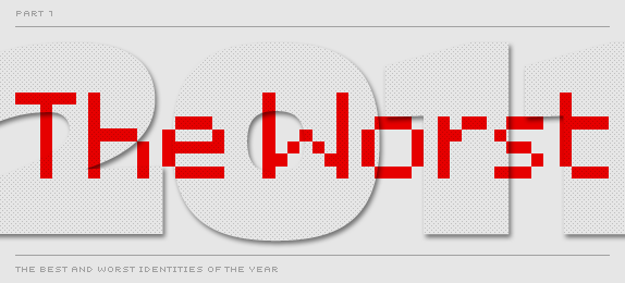
The Best and Worst Identities of 2011, Part I: The Worst
[From the wit of Armin Vit at Brand New.]
Without much further introduction — since now you know what to expect from our end of year round-ups — here are The Worst Identities of 2011. Enjoy! Part II: The Best will come next Monday.
For clarification: The choices are solely at my discretion. Original comments and voting results do not really influence my selections.
Without much further introduction — since now you know what to expect from our end of year round-ups — here are The Worst Identities of 2011. Enjoy! Part II: The Best will come next Monday.
For clarification: The choices are solely at my discretion. Original comments and voting results do not really influence my selections.
Friday, December 30, 2011
There’s an App for That: World War II Posters
From the classic 'Make Do and Mend' and 'Dig for Victory' to lesser-known gems, the posters featured in Great British Posters from the Second World War showcase the striking design, humour, memorable slogans and defiant spirit that helped to carry Britain through some of its darkest hours.
With this app you can:
- Discover the stories behind the posters with supporting information from IWM's experts
- Explore over 30 posters on your iPhone or iPad
- Get up-close to the posters by scrolling, pinching and zooming
- Share your favourite posters with friends via Facebook, Twitter and email
There’s an App for That: World War II Posters - UnBeige
Subscribe to:
Posts (Atom)